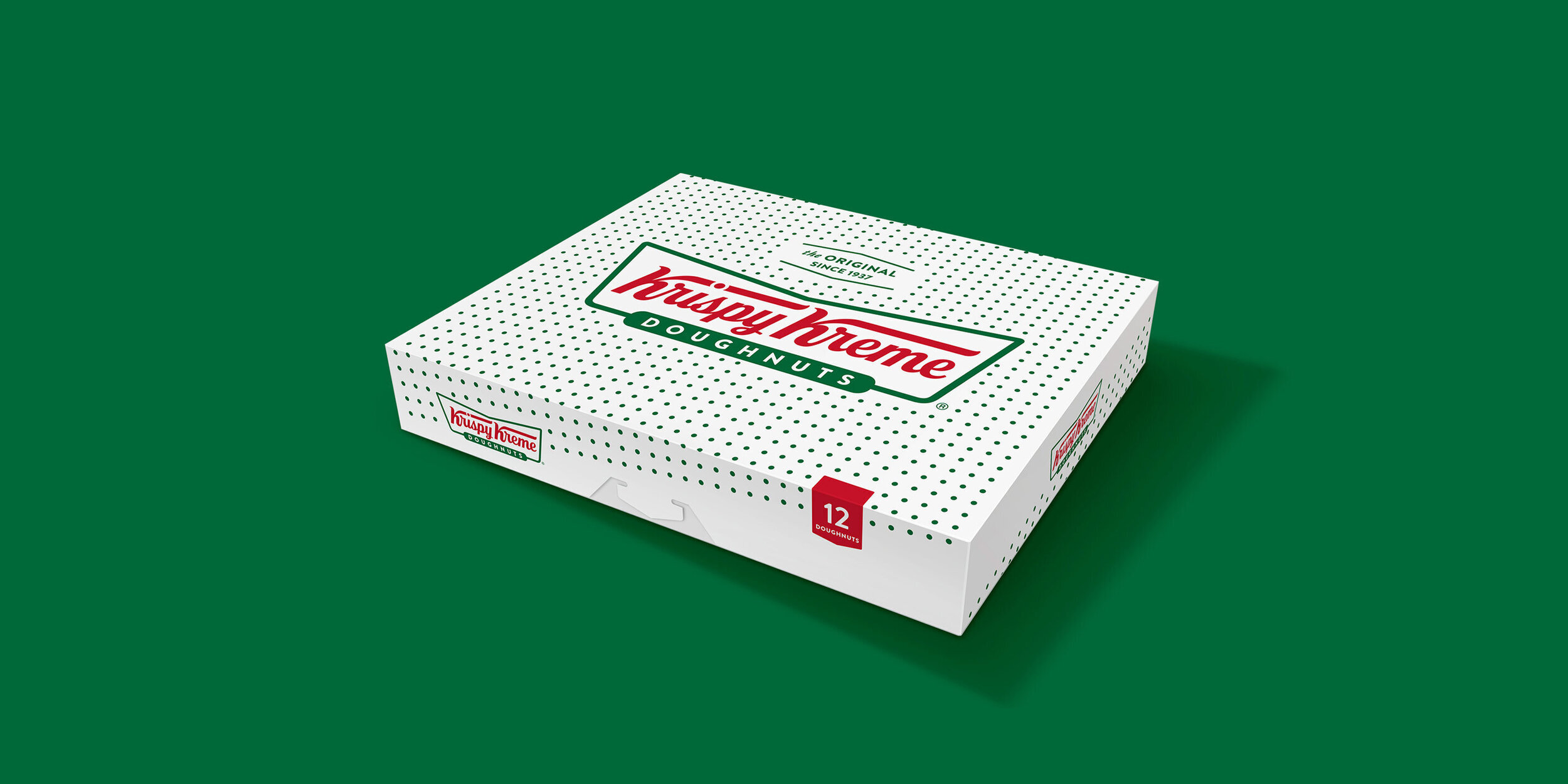
Krispy Kreme
The iconic brand, known for its rich heritage and fanatic following around the world, was looking to evolve the brand to attract new consumers and address the ever-changing marketplace.
With a packaging system that spans a variety of retail outlets, and with 70% of its stores outside the U.S., the challenge required global collaboration, comprehensive consumer insights, and a visual identity that would work around the world.
Working with Krispy Kreme’s leadership team and architectural partners, we extended the new visual identity to retail, initially launched outside of Detroit.
Consumer Research · Brand Equity Evaluation® · Brand Identity · Visual Language
Packaging Design · Visual Identity Guidelines · Brand Training · Store Concept


